rainbow connection
June 21, 2019
THE POWER OF COLOUR & HOW TO HARNESS IT
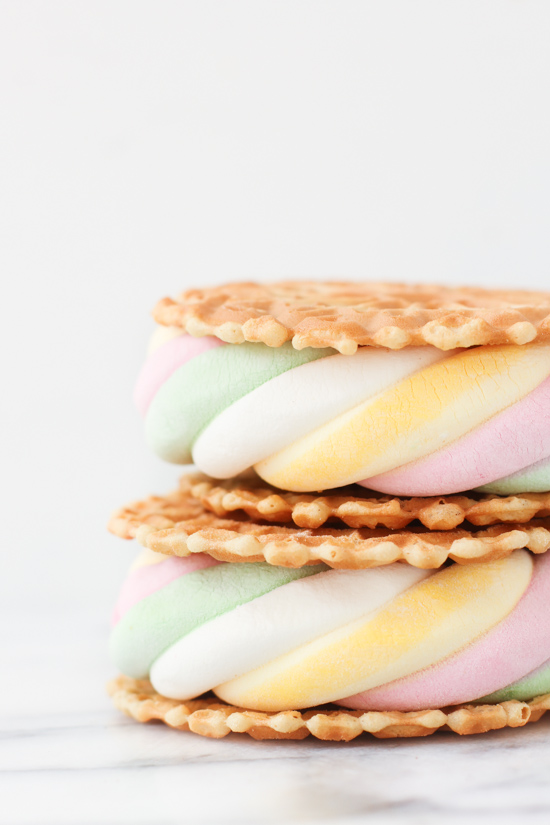
The cover photo on this blog post was its inspiration. When I saw it while browsing Pinterest during the week I loved the summery feel of it, though it’s not strictly a Summer photo. There’s no dripping ice cream or sunny beach. I clicked off the page and went about the rest of my day but I found myself thinking about it. I revisited the page several times. It surprised me how much it resonated with me. I don’t consider myself a fan of pastel colours. I prefer richer jewel tones or cool greys. It took me a bit of time to work out why this photo of marshmallows stuck with me. It’s because the stripes and colours remind me of a Summer dress I had as a child. This is a great example of the power of art and colour
The Colour Experience
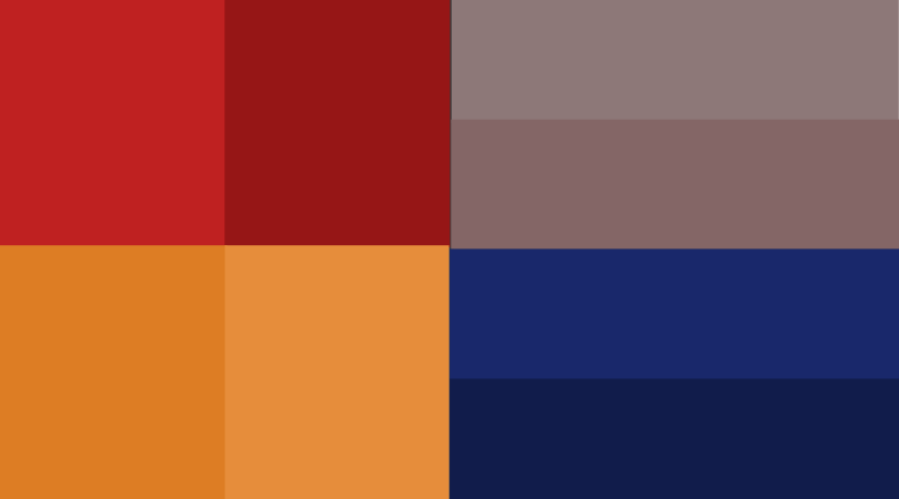
Colours are evocative. They sit at the top of the list next to scent, in my opinion. They can take us back to a special time or give us a sense of energy, comfort or intrigue. We each have our own set of feelings about different colours. We also, in fact, all interpret the same colours differently. This interpretation issue is, as I understand it, due to the way that light hits our eyes. It’s a fascinating aspect of colour, all the time the things we see are seen slightly or dramatically different to the person next to us. Try it out for yourself using the colour strip below with a friend and see how you each describe the colours
Our ability to differenciate hues is another interesting aspect of this. Try this TEST for more on that.
Basically, the colours we like and are drawn to is something that adds to the bundle of things that make us unique individuals. Our preferences are informed by our personalities and our experiences.
The heART of the Matter
As with every 2020 blog post there is an art connection here and this time it relates to how we can translate our colour choices from our favourite paintings onto our interior décor. The artwork you choose to display in your home will add a great personal twist on your interior design but another great way to add a personal spin is to look at your favourite artwork before you choose your colour scheme. It can be a piece you own, a famous painting you love or any image that strikes you (like a photo of marshmallows 😉 )
If you have an interior décor project in the pipeline or you’re struggling to choose colours or artworks for it that’s what 2020 Personal is all about. So get in touch and let me give you a helping hand!
…. Just because I know that all of my fellow 80’s kids amongst you are singing it since you read the title of the post. Here’s Kermit!!

Add a comment
0 Comments